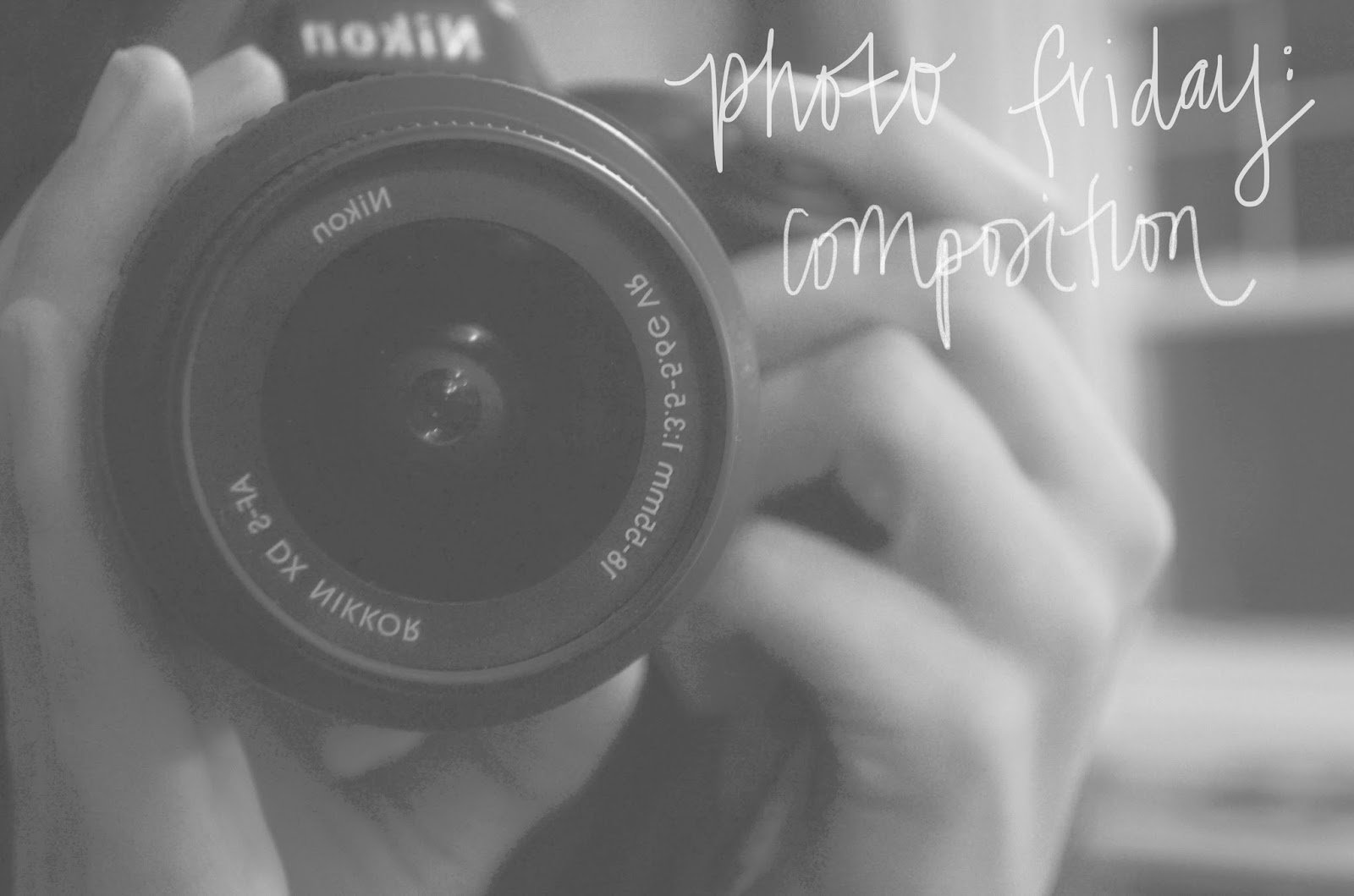
Hello hello! You may have noticed that I missed last Photo
Friday. Sorry I suck! Except not really because I was in NYC and it was pretty awesome.
Anyway, I’m back with a new lesson today…and this should be useful to anyone,
not just those of you with SLR cameras. Yay! Hope that makes up for the missed
post. Also, I’ve decided to separate my lesson posts and photo posts…it just
makes the posts too long to put them together. So, from now on I will share the
photos I take using these lessons in “Bits + Pieces” posts with lots of photos
and maybe some personal ramblings about them for your viewing/reading pleasure.
Today we are talking about composition. Composing a great
photo is something you can learn about and improve on constantly…lots and lots
of trial and error. I did a bunch of reading and decided to throw together a
short list of a few points about composition that seem useful, and that I’d
like to keep in mind as take photos this week. I’ve also included a couple
links to the sites I read with each point so you can read more, should you feel
so inclined.
Avoid the Middle: The
middle is boring. You’ve probably heard of the “Rule of Thirds.” This was one
of the first things that came up when I began my research. Basically, divide
your image into thirds, and position the subject in the left or right third of
the composition. Most of the things I read said to avoid the middle, but also
not to be a slave to the rule of thirds. It seems like it is a good thing to
learn about and understand – once you understand it you can break it in a way
that still works.
Creating a Single
Point of Interest: Here are some ways to bring the focus to your main point
of interest – eliminate distracting elements from the frame, use a wide
aperture to blur out other details (learn how to do that here), make use of
color, use leading lines or negative space to direct attention to it, break the
pattern, create contrast, make the point brighter…there are lots of ways to do
it! But it is important to know what
your point of interest is and really think about how you can make the viewer see
the image the way you want them to.
More Here:
Use
White/”Free” Space: This one is also one of the tips for
drawing attention to your point of interest, but I thought it was a good one to
talk about specifically. They describe it well on “Here Comes the Sun” Blog: “If you
have a subject who is pointing to the right, then give the composition a lot of
free space on the right side. If your subject is looking up, then allow the
free space to happen above them. Think of it as leading your viewers eyes and
emotions where you want them to go."
More Here:
Leading Lines: This
is also helpful in defining your point of interest. Use lines (such as roads,
telephone lines, etc) to draw the eye towards your subject.
More Here:
Make Use of Framing: This
is exactly what you think it is! Find a natural frame to make your photo more
interesting and draw attention where you want it.
More Here:
Think About Which Way
You Want to Shoot: Shoot vertically to emphasize height. Shoot horizontally
to emphasize width.
Add Depth: Think
about how to include a foreground and a background.
More Here:
Happy photographing! I would love to hear any tips you find
useful for composing photos in the comments! I will be back tomorrow with some
of the photos I’ve taken over the last couple of weeks.


This is a fantastic entry! I really enjoyed reading it. I am a self-taught photographer... I basically "play it by eye". But I love everything about this post!
ReplyDeleteI have been trying to improve my photography also. I got a 50mm lens for Christmas and it has changed my life. Especially when depth and blur is concern.
ReplyDeleteI'm taking a continuing ed course at one of the local colleges. The price compared to some of the online places is amazing… only $129 for 6 in-class sessions compared to the thousands of dollars photography school charge.
This is so great!! I hadn't heard of the rule of thirds until recently and it's interesting! When I used to draw (I should really get back into it), I used lots of white space because it makes you focus on what's there and what isn't. Great post!
ReplyDelete~Sara
Sincerely, Sara
Thanks for the advice! This was really helpful!
ReplyDelete